
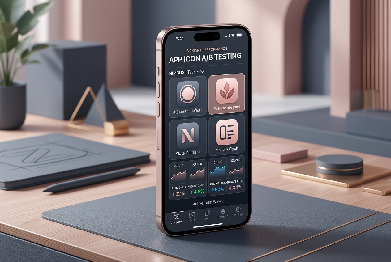
A useful app icon remains recognizable when it is small, surrounded by competitors or seen without the app name. Start by testing silhouette, contrast and meaning before debating subtle rendering details.
Define what the icon should communicate
Write a short brief with the product’s role, audience and desired impression. Decide whether the icon needs to signal a familiar category or establish a distinctive brand. Those are different design problems and may lead to different concepts.
Avoid making the icon carry the full product story. A small symbol cannot explain every feature, and adding more objects usually reduces clarity.
Compare concepts in realistic contexts
Place each concept in a store results view and on a device home screen. Examine it at small sizes and against light and dark surroundings. Ask viewers to describe what they remember rather than simply which option they like.
For an imaginary focus app, a clear geometric mark might be easier to recognize than a detailed desk illustration. That does not prove it will convert better; it identifies a concept worth testing.
Keep the experiment interpretable
Document the hypothesis behind each variation. If every version changes shape, color, symbol and style, the winning result may be hard to turn into a reusable lesson. You can still compare broad concepts, but be honest about what the result explains.
Store experiments should be evaluated in their audience and market context. An icon that increases curiosity but attracts people expecting a different product can create downstream disappointment.
Prepare the handoff
Deliver editable source files, required exports and a record of the chosen direction. Check current platform specifications before release; production requirements evolve. Make sure the icon remains connected to the visual identity users encounter after installation.
The decision is not between art and performance. Good icon work uses design judgment to create credible options and evidence to decide how those options perform in the real world.